What is a responsive site? Why is responsiveness important?
A responsive site is one that changes layout or design elements to respond to different screen sizes. It's important that sites are responsive, because a user could visit your site from a number of different devices, and you want the site to look good across all of them.
What is mobile first design? why is it important?
Mobile first design is when you design your website to look good on smaller devices first. You can do it either way, but mobile first is a good idea because when you go from big to small there are a larger amount of break points that could affect your design. If you start small you will hopefully only have to change the design once to suit a larger screen. Smaller devices also usually have less power, so it's a good idea to run less code on them where possible, and leave the media queries for larger devices.
What are frameworks? What are their pros and cons?
Frameworks are groups of pre-defined CSS classes. Frameworks can be useful as a time saver, as you can use pre-defined columns and styles to save time while you are coding, so you don't have to reinvent the wheel. However, frameworks can be annoying, as sometimes they will have elements you don't know about, like padding or margins, which can be confusing. They could also be unhelpful while learning, as they do some behind the scenes 'magic' to make things responsive which could be difficult to understand.
What is a wireframe? Why do we use them?
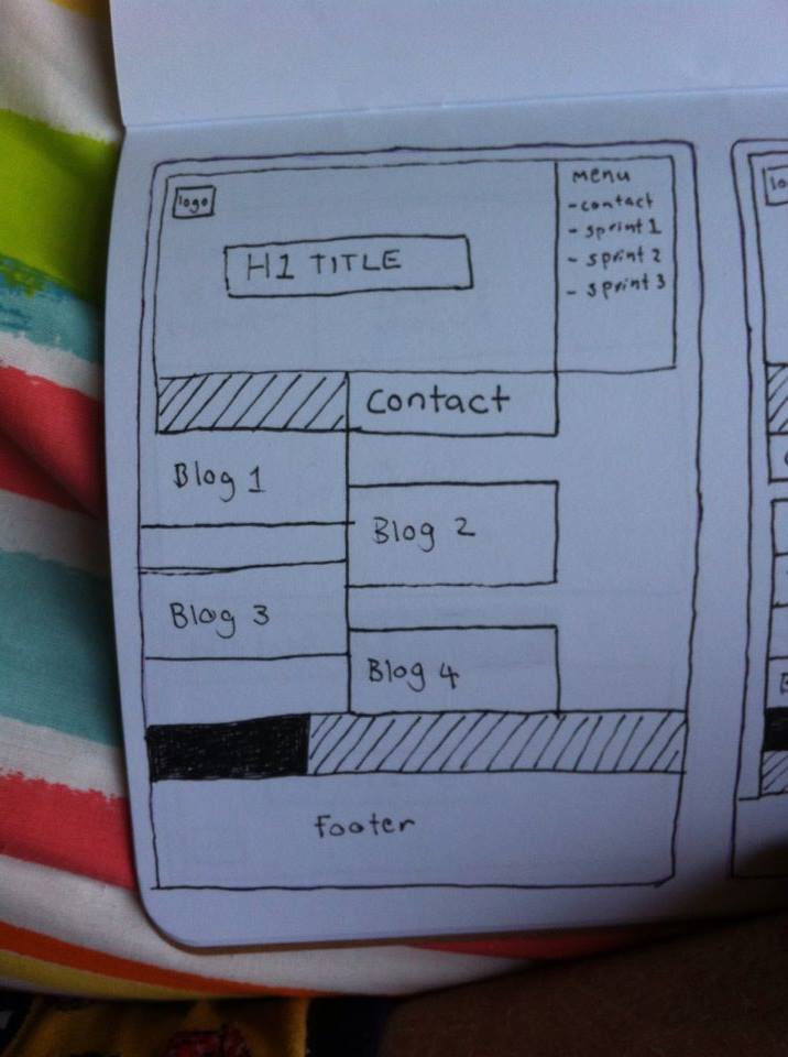
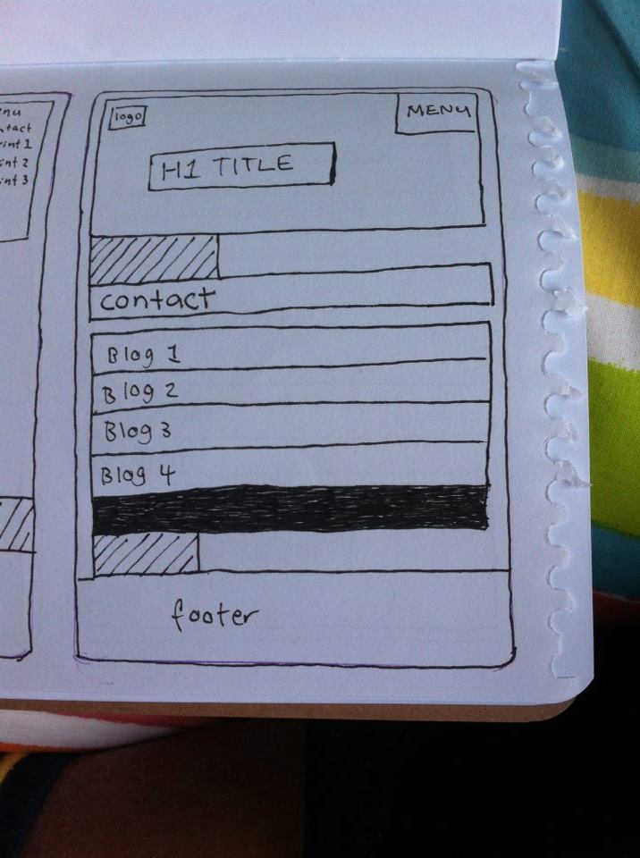
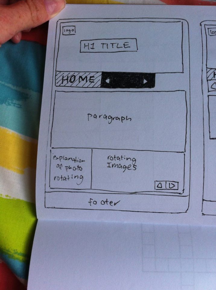
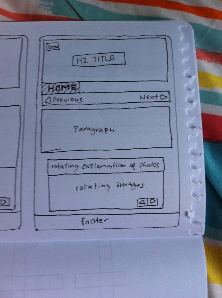
A wireframe is a sketch which outlines and boxifies key elements on the page. They are a useful tool to help you break down a design so you can easily see how you need to markup your html. They are also a easy way to show a client your ideas for a website so you can check that you are on the same page, and all the necessary functionality is there, without getting bogged down in design elements like colours and fonts. There are also quick and easy to produce, so you can communicate with the client before you spend lots of time writing code.


